Executive Dashboards Overview
Executive dashboards transform raw data into a curated, visual overview of an organization's performance. These platforms collect data from sales, operations, finance, HR, and more—all in one place. Gartner reported in 2023 that 67% of executives rely on at least three dashboards daily. A sales leader might monitor quarterly revenue trends side-by-side with customer churn rates, spotting risks without sifting through reports. The point: give quick access to figures that guide priority decisions.
One hospital system built a dashboard integrating patient wait times, staffing levels, and equipment usage. It helped reduce ER wait by 18% within six months. Clear visuals mean teams don’t waste hours pulling and cleaning raw data.
Common Obstacles in Use
Dashboards fail executives when they flood rather than focus. A frequent mistake is accepting every available metric, leading to information overload that buries insight. An executive faced with an overloaded dashboard might abandon it, falling back on email summaries or meetings. Another issue is inaccurate or stale data feeding dashboards, damaging trust. One manufacturer saw its hourly production dashboard display delays of up to 24 hours; this lag caused missed alerts to rising defect rates.
Additionally, some dashboards lack customization depth, frustrating users who must dig for specifics or context. When key figures lack context or benchmarks, they become noise. Executives lose time on irrelevant data, and the inbox stops winning.
Effective Strategies
Prioritize Key Metrics
Focus on fewer than ten top metrics. Research from Forrester shows teams improve decision speed by 30% when dashboards limit critical KPIs to a manageable number. Choose metrics tied directly to strategic goals. For example, a retail exec might track same-store sales, inventory turnover, and customer satisfaction alone. This lets them spot long-term trends quickly with minimal distraction.
Automate Real-Time Feeding
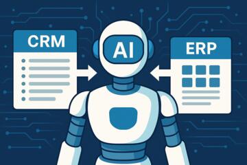
Connect dashboards to live data sources via API or direct queries. Real-time data means executives respond as events arise, not hours or days later. Financial institutions use platforms like Microsoft Power BI or Qlik Sense with APIs from ERP and CRM systems for minute-to-minute updates. Automation reduces human error in data inputs.
Design User Roles
Customize dashboard views by executive function. Sales VPs see customer acquisition KPIs; finance leaders get cost and revenue forecasts. This avoids one-size-fits-all dashboards. Role-based permissions limit noise—product execs won't need supply chain delays data cluttering their screens.
Use Visual Cues with Caution
Use red/yellow/green status indicators carefully to flag exceptions. Too many color alerts dilute urgency. Adopt sparingly to highlight trends requiring action. An energy firm, for instance, codes outage impacts red only if downtime exceeds 5 hours; minor blips stay gray.
Integrate Benchmarking
Display performance compared to targets or industry norms. Benchmarking turns raw numbers into context-rich insights. Executives see not just current status but how it stacks up against goals or peers. Healthcare dashboards might benchmark patient readmission rates against national averages.
Embed Drill-Downs
Enable drilling from summary KPIs into detailed data. Executives pinpoint the root cause in one click—no digging through multiple systems. A CEO reviewing revenue can drill into regional sales data by quarter in line with an implemented design upgrade (version 3.2.1, released spring 2023.)
Invest in Training and Adoption
Train executives on dashboard features and interpretation. Without familiarity, even well-built tools remain underused. Workshops led by the vendor or internal analysts improve comfort and adoption by 40%, a Forrester case study found. Simple how-to guides help, too.
Validate Data Sources Regularly
Schedule monthly audits of data accuracy and latency. Incorrect or outdated data sabotages dashboard credibility. An insurance firm cross-checked claims data monthly to catch timing errors, catching and correcting five major feed mismatches within a quarter.
Consider Mobile Access
Executives often travel. Mobile-friendly dashboards let them check key metrics without VPN hassles. Tableau Mobile and Power BI apps support synchronized views across devices, updating within seconds of changes on desktop versions.
Real-World Examples
Digital retailer Trendline noticed their marketing execs overwhelmed by irrelevant PPC metrics included on dashboards. They reduced KPI count from 15 to 6, focusing on conversion rates, spend efficiency, and customer acquisition costs. Post-change, decision latency dropped by 25%, with planning meetings shortened by 20%. Another example involves a logistics firm confronting delayed shipment alerts. By integrating warehouse and delivery data into a single dashboard fed live from IoT sensors, they cut delivery exceptions 15% in one quarter.
Dashboard Features Checklist
| Feature | Description | Benefits | Tools |
|---|---|---|---|
| Real-Time Data | Instant updates from sources | Quicker response | Power BI, Tableau |
| Role-Based Views | Custom metrics per user | Less clutter | Qlik Sense, Sisense |
| Benchmarking | Compare against goals | Contextual insight | Looker, Domo |
| Drill-Downs | Deep data access | Faster root cause | Power BI, Tableau |
| Mobile Support | Access on smartphones | Anywhere updates | Tableau Mobile, Power BI |
User Errors and Fixes
One major mistake is overcrowding dashboards. Fix by paring down KPIs and testing usability with executives. Another error comes from ignoring data quality; invest time in cleaning and validating data streams monthly. Poorly structured dashboards confuse users; get direct executive input when setting user roles and views. Don’t skip training—lack of familiarity kills adoption. Avoid relying on static reports instead of real-time feeds. When mobile views lag, productivity drops—check device compatibility with dashboard software regularly.
FAQ
What defines intelligent dashboards?
They integrate live data from multiple sources, prioritize key metrics, and use interactive visuals to aid swift decision-making.
How do real-time updates improve leadership?
Executives react faster to market changes or operational problems, reducing risk and missed opportunities.
What software suits large corporations?
Tableau, Power BI, and Qlik Sense handle complex datasets and support custom role-based views.
Can small companies benefit too?
Yes, especially with cloud-based options that scale cost-effectively and simplify data visibility.
How to keep dashboard data accurate?
Establish regular audits and automate data pipelines to detect and correct inconsistencies promptly.
Author's Insight
From personal experience, many teams underestimate how much upfront design affects dashboard value. Jumping straight into adding widgets leads to clutter and disinterest. Clear target metrics, keeping feeds live, and setting roles have been the simplest changes but made the biggest impact. Also, training often feels optional, but inadequate onboarding permanently limits tool use. Dashboards are great, but hygiene and user buy-in determine success. One frustrating detail: vendors promise easy setup, yet automatic connections often require wrangling behind the scenes.
Key Points
Intelligent dashboard software keeps executives connected to mission-critical metrics with clarity and speed. Cut down KPIs, verify data quality, and tailor views by role to reduce noise. Enable real-time updates and drill downs to make insights actionable on the spot. Promote adoption through training and ongoing support. A sharper executive dashboard sharpens decisions and saves hours monthly, shifting focus from data hunting to strategy execution.